
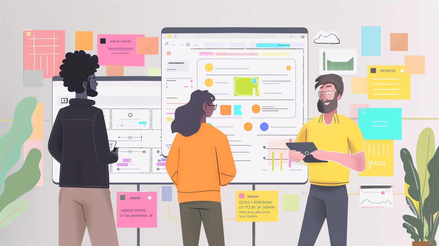
Both stylescapes and mood boards have become essential tools in the design industry, serving distinct purposes and offering unique benefits. As design continues to evolve, these visual aids have transitioned from physical collages to dynamic digital platforms. This shift has enhanced their functionality, allowing for more efficient collaboration and iteration. Understanding the core differences and applications of stylescapes and mood boards can significantly impact the success of your design projects.
What Are Stylescapes and Mood Boards?
A stylescape is a comprehensive visual representation that encapsulates the core elements of a brand’s visual identity and user experience. Think of it as a billboard for your brand’s design language, showcasing elements like color palettes, typography, iconography, imagery, components, and patterns.
- Color Palette: This is a curated selection of colors that reflect your brand’s personality and tone, ensuring a cohesive look across all platforms.
- Typography: Specialized fonts, sizes, and styles are selected to create a consistent reading experience and to align with the brand’s identity.
- Iconography: A set of icons is crafted to match the brand’s visual language, enhancing user interface and experience.
- Imagery: Carefully chosen images that evoke the intended tone and atmosphere of the brand.
- Components: Pre-designed UI elements like buttons, forms, and navigation menus that can be reused throughout the design.
- Patterns: Reusable design patterns, such as layouts and grids, to maintain a consistent structure.
These elements help to ensure that the design remains cohesive, reducing inconsistencies and design debt.
A well-crafted stylescape streamlines the design process by offering pre-designed components and patterns, facilitating better communication among designers, developers, and stakeholders. This shared visual language helps align everyone involved in the project, creating a unified understanding of the brand’s identity and tone.
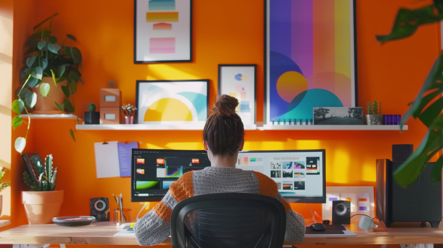
Recent UX/UI design trends, such as dark mode, neumorphism, and interactive elements, have further shaped the development and use of stylescapes, making them more immersive and accessible. Tools like Figma, Sketch, and Adobe XD enhance the process by offering features such as real-time collaboration, automated design system generation, and component libraries.
Key Differences Between Stylescapes and Mood Boards
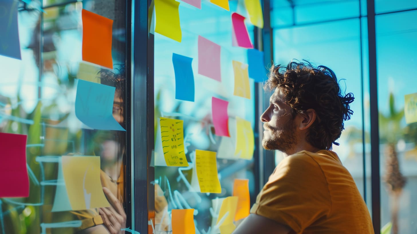
Traditionally, mood boards were physical or digital collages that pulled together images, colors, and textures to present a design concept. These boards were static and primarily served as inspiration, offering a glimpse into the visual aesthetics of a project. They were straightforward but limited in conveying complex, interactive ideas.
Stylescapes have evolved from these basic mood boards into more dynamic tools that can communicate a richer, more nuanced vision.
Here are some key ways in which stylescapes have advanced:
- Incorporation of 3D Elements and Animations: Unlike mood boards, stylescapes can include 3D elements and animations. This makes the design more engaging and interactive.
- Responsive and Adaptive Designs: Stylescapes utilize advanced digital tools that create responsive designs, allowing for easier sharing and accessibility across various devices.
- Multimedia Integration: Stylescapes can integrate videos, audio, and even virtual reality (VR), providing an immersive experience that conveys the design’s feel and functionality.
- Real-time Collaboration: Tools like Figma, Sketch, and Adobe XD facilitate real-time collaboration and feedback. This ensures continuous refinement and iteration, making the design process more efficient.
Stylescapes also bring user experience elements into the design process
Camiel Bos
- Interactive Features: Hover effects, animations, and scrolling elements make stylescapes more dynamic.
- Responsive Design: Stylescapes adapt to different screen sizes, ensuring a consistent experience across platforms.
- User Flow Visualization: They map out user journeys, helping designers understand interactions better.
- Feedback Tools: Commenting and annotation features enhance collaboration and feedback from stakeholders and users.
In summary, stylescapes transform static collages into interactive, user-centered tools that enhance the design process. They offer a comprehensive, engaging approach that mood boards simply can’t match.
When to Use Stylescapes vs. Mood Boards
Choosing between a stylescape and a mood board often depends on the specific needs and scope of the project.
Stylescapes are ideal for complex, large-scale projects that require a deep understanding of design direction. These might include branding initiatives, UI/UX design, or architectural endeavors. When multiple stakeholders are involved, or when a project demands a high degree of customization and innovation, stylescapes offer a detailed and immersive representation. This allows everyone to visualize the end product more clearly, making informed decisions easier to achieve.
In contrast, mood boards are perfect for smaller-scale projects that need a quick, high-level understanding of the design aesthetic. This includes social media campaigns, event promotions, and other projects with tight deadlines or limited budgets. Mood boards excel in providing a rapid visual snapshot of the design mood, making them ideal for initial brainstorming sessions where an emotional or intuitive connection with the design is crucial.
Recent trends in client communication and project management also influence the choice. The growing emphasis on collaboration, transparency, and the use of digital tools means stylescapes are often preferred. They are easier to share, collaborate on, and iterate upon, fitting seamlessly into digital environments.

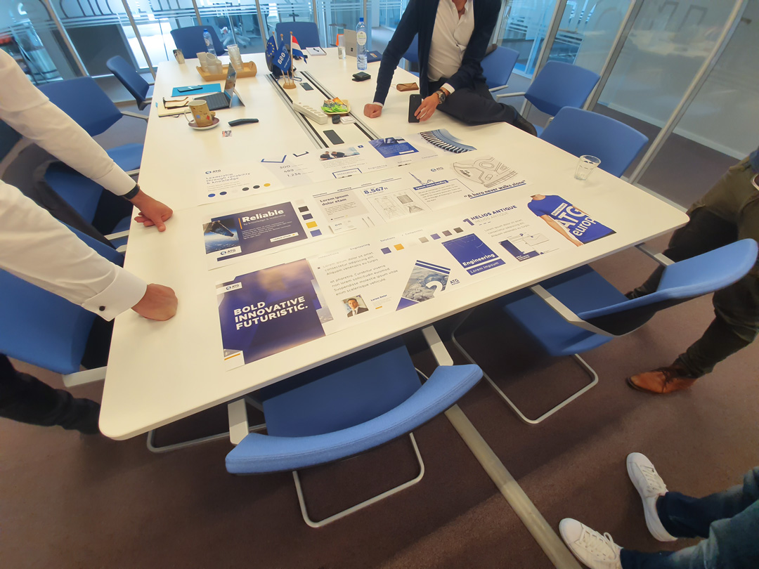
My project with ATG Europe was a perfect example of such a project.
Read it here
However, using both tools together can be advantageous. For projects requiring both a high-level aesthetic understanding and a deep design direction, such as branding projects with multiple stakeholders, combining stylescapes and mood boards can be beneficial. This approach provides a comprehensive view of the design concept, facilitates better communication, and enables rapid iteration and refinement.
In summary:
- Use Stylescapes:
- For complex, large-scale projects
- Multiple stakeholders involved
- High customization and innovation needed
- Use Mood Boards:
- For small-scale projects
- Tight deadlines or limited budget
- Emotional or intuitive design connection required
- Use Both Together:
- For a comprehensive understanding of design
- To facilitate better communication and feedback
- For rapid iteration and refinement in design projectsCreating Effective Stylescapes
Steps to Create a Stylescape
Creating a stylescape involves several key steps to ensure that your design vision is clear, cohesive, and effective. Here’s a straightforward guide:
- Define Your Project Scope and Objectives: Start by outlining your project’s requirements and goals. This ensures that all gathered assets align with your design vision and overall objectives.
- Gather and Organize Digital Assets: Collect reference materials such as images, videos, and design patterns. Use a consistent naming convention to categorize and label these assets, making them easy to search and access. Tools like Google Drive, Dropbox, or Figma can be invaluable for storing and sharing these assets.
- Employ the Latest Design Tools: Utilize cutting-edge tools like Figma, Adobe XD, Sketch, InVision, and Mural. These platforms facilitate collaboration, rapid prototyping, and centralized design asset management.
- Use Design Systems and Style Guides: Establish a design system or style guide to ensure consistency in elements such as typography, color, and imagery. This helps in maintaining a coherent look and feel throughout the stylescape.
- Integrate Functional Design Elements: Incorporate usability and accessibility elements into your stylescape. Follow guidelines like WCAG 2.1 to ensure inclusivity. Consider mobile-first design principles to optimize for various devices.
- Collaborate and Iterate: Regularly update and refine your asset library. Collaborate with team members and stakeholders using cloud-based tools for feedback and iterations. Conduct user testing to validate design decisions and ensure they meet user needs.
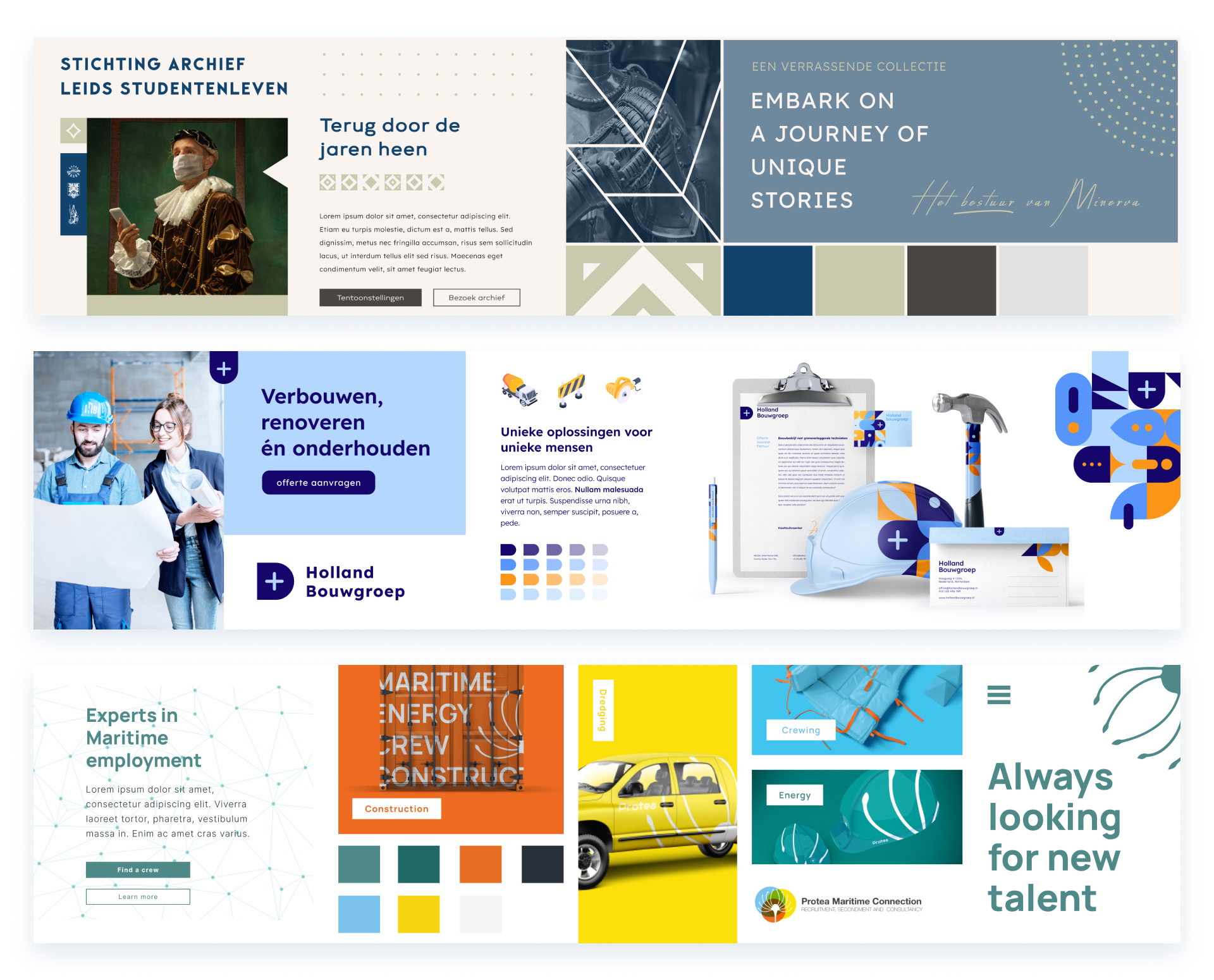
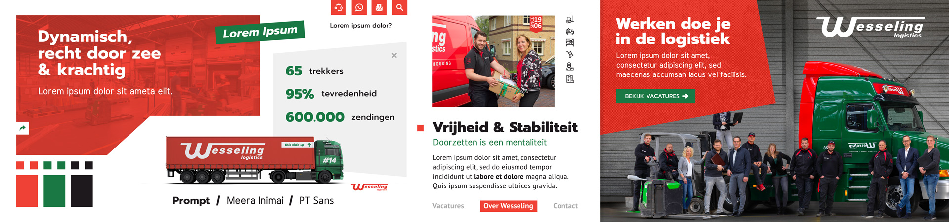
Here are some of my stylescape examples
Tips for Effective Stylescapes
- Emphasize Accessibility: Ensure your stylescape is accessible to everyone by following accessibility guidelines.
- Stay Updated: Continuously add new assets and refine existing ones to keep your stylescape relevant.
- Engage Emotionally: Create stylescapes that evoke emotions and build connections with users.
By following these steps, you can create an effective stylescape that enhances the user experience and aligns with your project goals.
Use my stylescape showcase as inspiration
Crafting Impactful Mood Boards
Creating a mood board is an essential process for setting the visual direction of a project. Follow these steps to craft a compelling mood board:
- Define Your Concept or Theme: Start by deciding the overall theme or concept of your project. This will guide your choices and ensure that all elements on your mood board are cohesive.
- Gather Visual Inspiration: Use various sources like magazines, online platforms (Pinterest, Behance), and even your surroundings to collect images, textures, colors, and typography that align with your theme.
- Select a Consistent Visual Language: Choose a color palette, typography, and style that complement each other. Consistency is key to creating a unified and impactful mood board.
- Organize Your Elements: Group similar items together. For instance, place all color swatches in one section and images in another. This creates a clear structure and makes the board easier to understand.
- Create a Narrative: Arrange your elements in a way that tells a story or conveys a particular emotion. A well-structured narrative engages viewers and helps them connect with the project vision.
- Use Digital Tools: Leverage tools like Adobe XD, Figma, or Canva to create your mood board. These platforms offer templates and design tools that simplify the process and allow real-time collaboration with team members.
- Balance with Whitespace: Avoid clutter by using whitespace effectively. This helps highlight key elements and guides the viewer’s eye across the board.
- Iterate and Refine: Continuously tweak and update your mood board based on feedback. Refinement ensures your board stays focused and effective as the project evolves.
By following these steps, you can create a mood board that not only looks great but also effectively communicates your project’s vision.
Recent Trends and Developments
Advancements in design systems and style guides have reshaped how designers use stylescapes and mood boards. Here’s how:
Increased Focus on Consistency: Today’s design systems emphasize uniformity across various platforms. Stylescapes and mood boards help ensure that all design elements align with the brand’s identity. By visually mapping out these elements, you can maintain consistency across your projects.
More Intentional Design Decisions: Design systems require thoughtful and deliberate decisions. Using stylescapes and mood boards allows you to explore and validate these decisions visually. This leads to more cohesive and intentional designs, reducing the risk of misalignment.
Streamlined Design Processes: Modern design systems streamline workflows, enabling you to focus on creative aspects. With stylescapes and mood boards, you can quickly explore and communicate ideas, making the design process more efficient. This reduces the time spent on revisions and helps in rapid prototyping.
Greater Emphasis on User Experience: Design systems now prioritize the overall user experience rather than individual design elements. Stylescapes and mood boards allow you to create immersive experiences that align with these overarching goals. Using these tools, you can map out user journeys and ensure that every interaction reflects the design system’s principles.
To sum up, advancements in design systems and style guides have turned stylescapes and mood boards into crucial tools for maintaining consistency, making intentional decisions, streamlining processes, and enhancing the user experience. These tools help you create a unified visual language, ensuring all elements work harmoniously within the broader design framework.
Conclusion
Stylescapes and mood boards each offer distinct advantages, making them indispensable in the design process. While mood boards excel at setting the visual tone and atmosphere, stylescapes provide a comprehensive approach by focusing on functionality and user experience. Understanding the strengths of each tool and knowing when to use them can lead to more effective and aligned design outcomes.
Using both tools can enhance communication with clients and stakeholders, ensuring everyone is on the same page. By incorporating recent technological advancements, such as digital tools and VR, designers can create more engaging and collaborative experiences. Leveraging these tools thoughtfully can result in a solid foundation for any project, reducing revisions and enhancing overall satisfaction.